

1
2
3
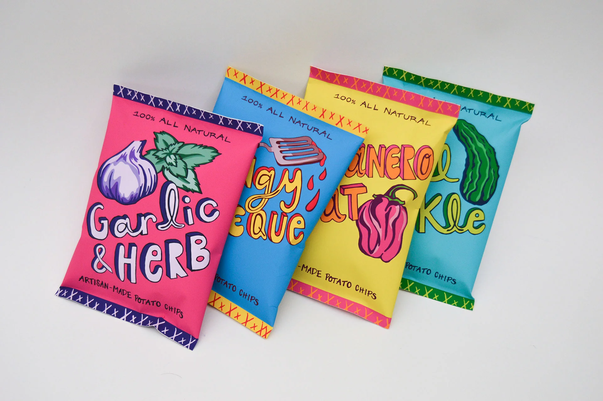
This assignment, for which I won a gold and best of show ADDY award in 2016, was to create a logo and bags for four differently flavored chips manufactured by an organic potato chip company named Darn Good Chips. I had to find a way to create a system that made all four chip bags look cohesive and a part of one brand yet still stand out individually. I wanted to design something playful yet still sophisticated. All of the illustrations and typography for the logo and the different flavor names are hand rendered. I also constructed these chip bags myself.